 on
Jun 16, 2026
on
Jun 16, 2026The front page of this site has always been a plain list of articles. Which would be fine if I wrote longer-form articles a bit more often. I do, however, make code commits to this site far more frequently. I’m also working on implementing a short-form section ( a.k.a. “bits” ) for links, videos and other small low-stakes thoughts. So the front page doesn’t really show the full story. In reality, there’s a lot more going on behind the scenes.
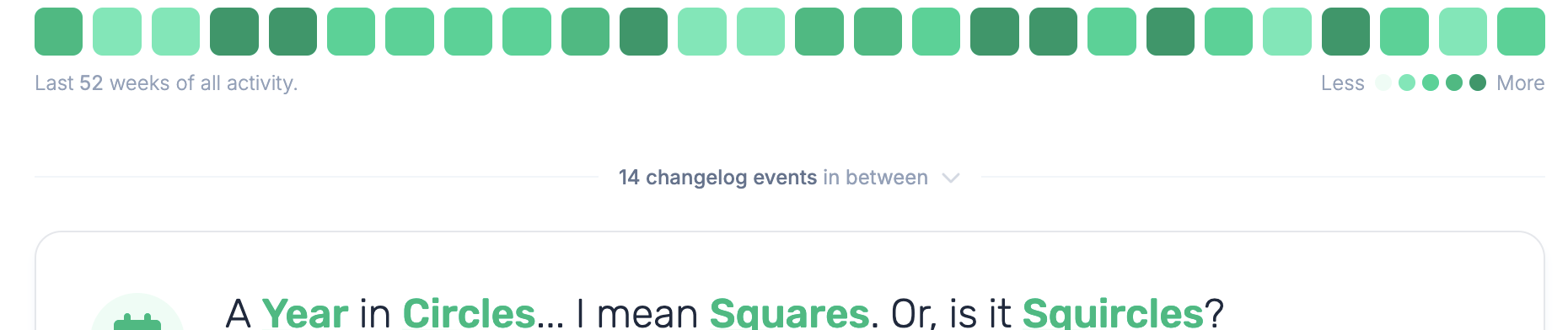
I want to fill those gaps in and not with more full-fat rows, but with a small line between each pair of articles. Something like “1 bit and 41 changelog events in between”; a kind of interstitial event timeline for all the work that never quite became a full blog post.
Why can’t I hold all these events?
The trick to merging things that don’t look alike… You’re never going to believe this… is to make them look alike. I already pull my GitHub activity for the changelog, or, at least, the last 100 or so events. So, I reused that, threw the bits in alongside it, and normalised the whole lot into one boring, uniform shape. This data structure doesn’t hold all the data for each event, but just enough to cover the highlights.
{{ $events = $events | append (dict
  "kind"  "commit"
  "date"  (time.AsTime .commit.author.date)
  "title" (index (split .commit.message "\n") 0)
  "url"   .html_url
  "icon"  "code-commit"
  "colour" "green"
  "data"  .)
}}
Every piece of content on this site has at the very last these attributes. So created a unifying model is pretty straight-forward. A kind, a date, a title, a link, and enough leftover metadata to do something creative with later if I feel like it. I made a point of keeping the original object tucked away in data too; a gift to future Wilhelm.
Minding the gaps.
With one big sorted pile of events, the rest is just bookkeeping. Walk the articles newest to oldest, and for each one work out the window between it and the article above it. Then, scoop up every event that falls within the relevant dates:
{{ $upper := $now }}
{{ if gt $i 0 }}{{ $upper = (index $articles (sub $i 1)).Date }}{{ end }}
{{ range $e := $events }}
  {{ if and ($e.date.After $article.Date) (not ($e.date.After $upper)) }}
    {{ $group = $group | append $e }}
  {{ end }}
{{ end }}
The newest article’s “window” runs all the way up to now, so whatever I’ve been doing since the last post shows up at the very top. If there’s an empty gap the event list doesn’t render.
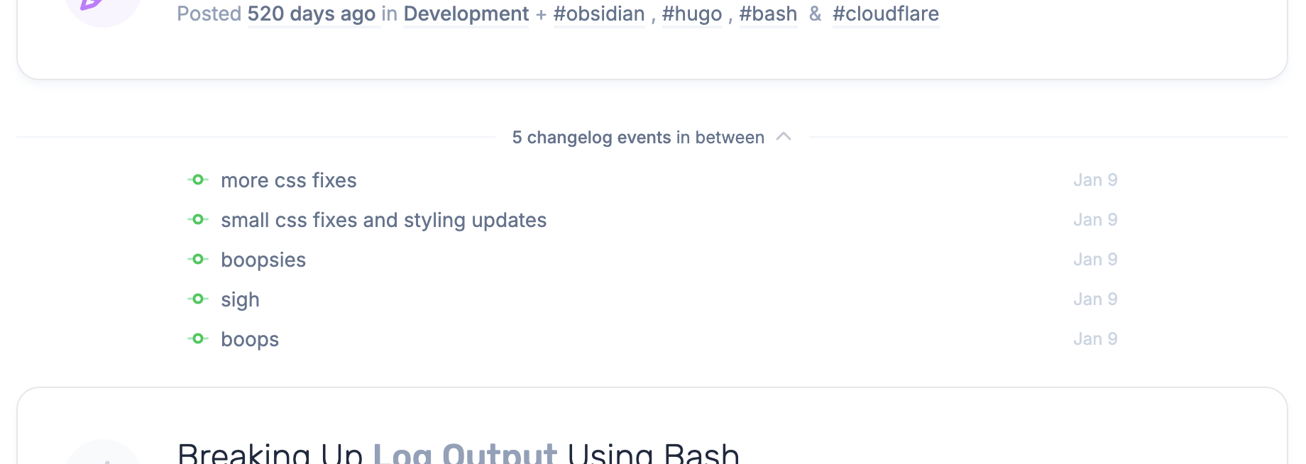
Listing the interstitial events.
A summary is nice, but I wanted to be able to actually see the events without leaving the page. Normally that’s where a pile of JS shows up. But, just as with the activity graph, we’re going to rely on pure HTML and CSS. The <details> element does the entire job for free:
<details class="group">
  <summary>... 41 changelog events in between ...</summary>
  <ul>
    <!-- one little row per event, complete with icon and link -->
  </ul>
</details>
Click the summary, the gap unfolds into a tidy little list of every commit, PR and bit. Each linked off to wherever it lives. The default disclosure triangle gets binned and replaced with a chevron that flips on open, courtesy of Tailwind’s group-open: variant. Still no JS and I’ll remain quietly smug about that.
Saving myself a small headache.
Finally, there’s the the responsive question. This site’s overall design isn’t exactly “mobile first” and viewing it on a small screen strips away a lot of detail already. All these thin dividers and fold-out lists look great on a wide screen and turn into a cramped mess on a phone.
I thought about it for a while and weighed up some clever reflowing. In the end I did the only sensible thing and hid the whole timeline below the sm breakpoint. On a phone you get the clean list of articles, but on a desktop you get the full story between them.
“Sometimes the right amount of effort is zero and the discipline is in admitting it.” Me. Wilhelm. I said that.
That being said, I do need to return and focus on making the mobile experience a bit more palatable.
In closing …
What I like about this is that it turns my worst blogging habit - vanishing for months and then resurfacing in a manic flurry - into something the site can actually narrate. The big rows are the headlines while the quiet lines between them are everything else.
It’s also wired up so I can grow it later without unpicking anything. Right now it’s counts and lists, but tomorrow it could filters, more details, or do something I haven’t thought of yet. All off the same pile of events.
For now, though, the gaps have something interesting in them. Which is a much nicer thing to scroll past than a year of silence.